Stylistic Skies
Or “Designing for what you can’t see.”
I began working with The MegaGame Society back around July of 2015. They were developing a MegaGame, something that had been growing in popularity over the last year or so - particularly after popular board game review site Shut Up and Sit Down posted a video of them playing a MegaGame. At least, that was how I heard of them.
The premise is that it combines a Roleplaying Game, a Board Game, and a Model UN. There are ~60 players generally in teams of ~5 who represent countries. So you’ll have India, the US, Russia, China, Japan, etc. And within a country you’ll have roles for each player. Head of State, Lead Scientist, UN Ambassador, Chief of Defense, and Deputy Head of State.
There are also teams of players for things like the Media, as well as the Aliens. In Watch the Skies, the players are controlling nations that get a very limited amount of information about what’s going on in the world around them and choose how they’ll react. Not only are there rumours of alien sightings, but they have no idea what their neighbors are doing and whether they already have relationships with the aliens. And if they say no, are they lying to you?
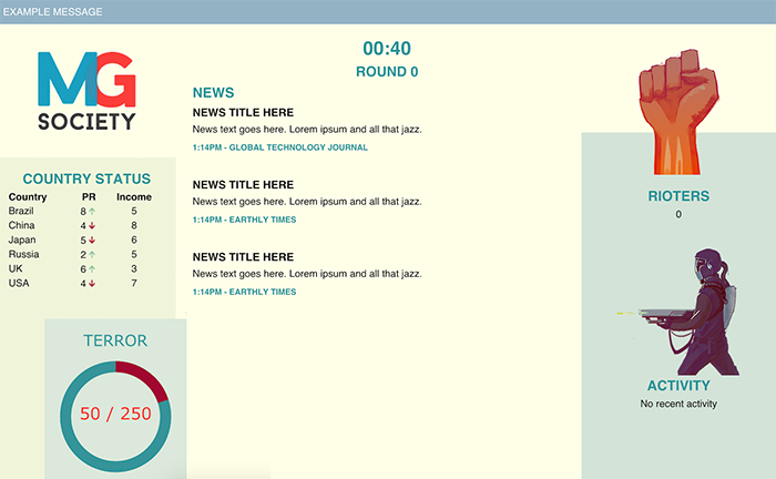
I included a bit of information on my Projects page about the mobile app that I’ve been working on, but long before that was a plan there was a single Dashboard for all the players. The Dashboard would give some basic information that was useful for everyone to have, but no interactivity beyond that.
It would display recent news articles, how much income each nation was gaining, the current state of the Terror Tracker (ie: how awful the crises in the world were going), as well as useful information like what turn it was, and how much time was left in the turn.
Let me preface this next bit by saying that I am not a “Designer” in the sense that most people use the word. I have some UX training and experience. I understand design philosophies. I can do some things with colours. It would be more accurate to say that I am not a graphic designer. I can sit down and work out a user flow with you right now. But if you asked me to make it pretty, make it stylistic, I’m going to fall short of your expectations, unless you expect something minimal. It is simply not a talent that I possess.
So when I started working on this Dashboard, I thought that was fine for the moment. I had things to figure out for how it would work, and I wanted to get all the data laid out in a way that made sense. I started to design it simply at first, with just colours and blocks. That worked just fine. Then I tried to do more with it.
At the time, we had limited resources, and there wasn’t a lot of artwork that we had in general, which made it difficult to pinpoint a particular style. Certainly it wasn’t cartoony, but you didn’t want to go with an “Independence Day shot of the White House being blown up”, either.
-
Super simple first draft
-
Internal display of the X-Com style. Gross. At least it was all CSS.
My first thought was to make it like X-Com. This would prove to be a terrible idea that I almost scrapped before even showing it to anyone. It was too dark and drab and wasn’t an accurate representation of the game. This wasn’t a game where you were sending soldiers in to fight aliens on the ground, where you had super sophisticated technology and were trying to protect the world on your own.
I was back at the drawing board before it occurred to me. This was a game about information, and the lack thereof. It was about world leaders lying to you, and how there was little you could do in retaliation. It was about not knowing what’s going on not only across the world but with your own neighbors.
Then it hit me, and I designed the page to look like a News Broadcast, drawing inspiration from Fox, and CNN, and some other places. The news articles were short because we use Twitter, so those could fit as “breaking news” across the bottom. The country incomes could work like a stock ticker. With a concrete direction, we even got someone to do a bit of art for the background.
-
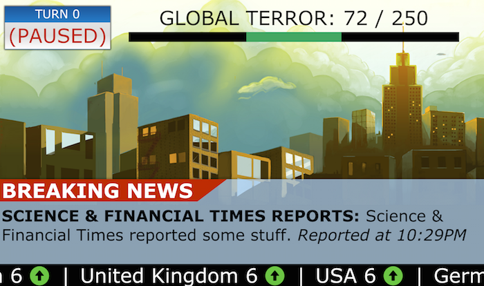
The final News Broadcast approach.
I had it pretty much finished when the other shoe dropped.
My understanding of this had been that it would be something for phones and desktops. And I thought, “Yeah, I can do that.” I have a desktop, a laptop, a tablet, a phone. I can check those things and verify that my design works on them. I can troubleshoot and test. But, no, this wasn’t going to be those things.
Instead, it was going to be displayed on a large projector. Questions that I had never had to ask before began popping up in my brain. “What’s the resolution on a projector that I don’t know the size of?” “How far away does it need to be visible from?” And of course there were some things that I knew already, like how notoriously terrible projectors were at washing out colours.
This was one of the most challenging projects that I’ve ever worked on, without it even being challenging in itself. The design was simple. The way it was coded was (fairly) simple. The wrench thrown into the plans was using a thing that I had no way of knowing how it would work in practise.
So, I did my best. I googled things, and tried to make the page incredibly responsive while maintaining incredibly large fonts. I won’t lie and say there wasn’t some doubt in my mind as to its usefulness or effectiveness - after all, I had no way of knowing what it would actually look like! It was all very academic and theoretical.
Then the other shoe dropped. (Wait, how many shoes is that?)
The Dashboard was going to be unveiled at PAX East - a large gaming convention here in Boston, in April. That I was going to be helping run the game at. Now, I have demoed iterated projects in front of peers. I have shown and spoken of several months of work in front of CEOs and VPs.
…But I also saw it ahead of time.
This was a triple threat. Not only was it the first time that I was seeing it, it was the first time that the company was seeing it, and it was the first time that the users were seeing it. No real prep time, no opportunity to make tweaks. As the saying goes, we had to “Do it live”.
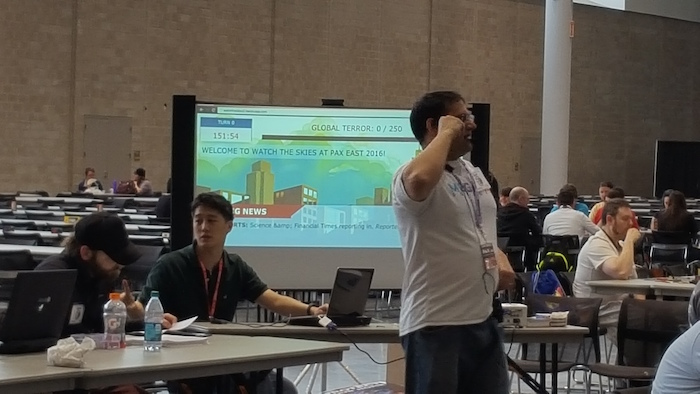
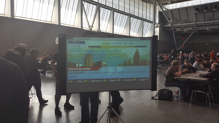
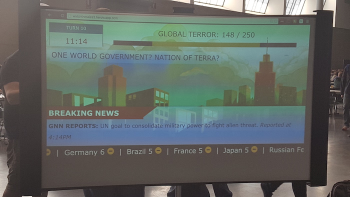
Above are a couple of photos that I took on my phone from a few feet away. It’s weird to say that I think I consider this a success. There’s obviously more vertical space than I anticipated, and certainly there are a few things that could have been spaced better and colours that could have worked better. But, you know, it was visible from a distance, and it looked pretty damn okay, if I do say so myself.