Kate
Project Description
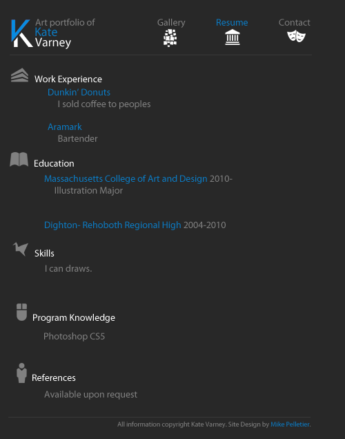
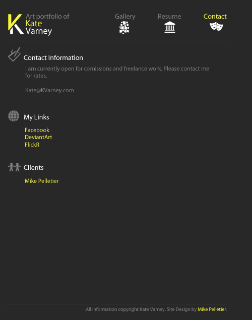
Kate was a local artist who had been attending MassArt when we began working together. For the design of her portfolio, the idea was to keep it simple - use icons instead of text where appropriate, and generally use dark and muted colours to let the art speak for itself without being bogged down.
We would work together on other projects as well - teaming up to make a couple of websites with her designing and me coding - but this was the first time that I designed something for her specifically.
It ended up being the case that it was not something that she cared to maintain, which is understandable, opting instead to use websites such as DeviantArt, ConceptArt.org, and Dribbble, which feature not only places to showcase your portfolio, but also commenting and advice - in short, communities.
Role
Designer
Technologies Used
- Photoshop
Reflection
I don't typically toot my own horn but I still think it was clever of me to make each of the three pages reflect one of the primary colours - from which everything else springs.
In retrospect, I vaguely wish I had been more serious with the content placeholder text, but alas. It's at least an accurate representation of how I tend to work.


